
Ever wanted to create with the freedom of colour? Would you like to step over the realism line in the sand with your art? Ready to add more atmosphere to your style?
Whatever the reason, freely adding extra colour to your work can be such a joy in the creative process and can add buoyancy to your art.
In over 2000 words and a bucket full of images, I show you how I transformed an ordinary image of a cat into something with mood and colour. You'll see the paints I used and provide photos of my work at each step. I’ll be sharing my process for choosing colours and how to build confidence to add play to portraits. This work is done in acrylics on cotton canvas.
Working with the Subject
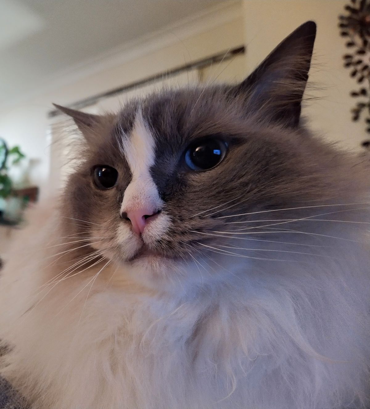
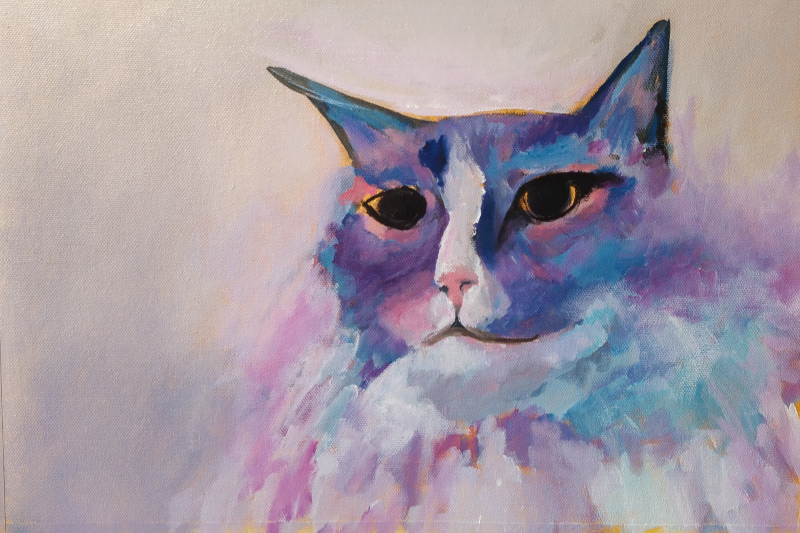
Cats are gorgeous creatures. I love their independence and style. Rather than paint a beautifully poised feline looking majestically into the distance, I wanted to capture one of the many moods that are so undeniably ‘cat’!
The cat in the photo has a noble defiance, a belief that he is elevated above his domesticated brothers and sisters and need I say, us, mere humans. The noble defiance is what I wanted to bring to life and express in my painting. The subject itself, while beautiful in its own right, isn’t the focus as such. It’s the feeling the subject brings forward to the viewer that is what I’m interested to convey.
Colour can bring portraits to life
The cat image above is a bit moody, the lighting is low and the subject is close to the camera but the big question is…
What is it I want to capture?
Yes, the cat and how it looks but also the mood, the expression, the atmosphere.
Creating Atmosphere
Here are 5 ways you can create more atmosphere and mood to your artworks.
1. More play, less perfection
Make a big impact by starting your work very loosely. This means bigger brushstrokes, less precision, slap on colours in areas that are ‘around about’ rather than exact. You can tighten up your style if needed as you go. A loose style in the beginning can help bring more playfulness and less perfection to create a mood rather than an exact copy. More specifically, you can create mood through.
2. Contrasting backgrounds
Contrasts and values are a great way to add mood to art along with mixing up soft and hard edges. In this cat portrait, I’ve used a lighter background as the colour of cat’s head is darker but the colour of the cat’s body is light. The very light colour as a background brings the darker head into focus.
3. Value Values
Make the dark parts dark. Sounds simple but not being afraid to make the darker colours strong can stop your work being monotone or look washed out. Use your colour value chart on the colour wheel for an indication of how strong or weak your contrasts are.
4. Soft and Hard Edges
Soften some edges. Blend through background colour into some of the edges around the cat can give the look of fur and softens the subject despite the moody expression.
5. Add a Colour Pop
Add colour. Once you know where your contrasts are, where the highest to lowest values are, you can add colours that are not part of the original image that look great and really lift the subject. For example, instead of adding more white to lighten a part of your painting, try a bright, light colour like yellow or pink.
Choose your colours
Sounds really simple.
Stick to a small colour palette.
Sounds simple again
If you know right from the start what colours you need, great. If you don’t…
Pick the side and quadrant of the colour wheel you want to work with. Is it cool or warm?
For this piece I wanted darker tones of violet and blues but keep the lightness of the cat with whites.
So, working with the cooler side of colour wheel, adding a cool white to the mix but also adding the option of something warm too felt important. Cadmium medium red filled my warm tone needs along with unbleached titanium, which has a hint of a yellow tone.
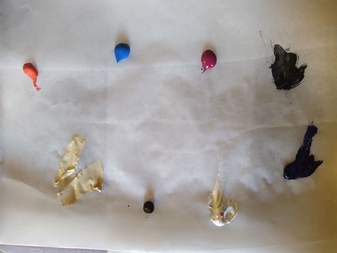
Colour can enhance, exaggerate and highlight a feature. The exact colours I used are listed below along with their label. I used professional quality paints for this painting.
- Cerulean Blue, Atelier
- Blue violet, Josonia
- Magenta, Matisse
- Burnt Umber, Atelier
- Cadmium Red Medium, Matisse
- Unbleached Titanium, Matisse
- Titanium White, Matisse
- Black, Matisse
- Raw Sienna as a canvas wash before painting, Matisse
Brush on outlines
Watered down raw sienna is used as a canvas wash before painting. Wait for this to dry before starting.
Getting started
Working quickly and without much precision, I used burnt umber, watered down a little on a small flat acrylic brush to loosely and lightly brush on some facial features outlining ears, eye sockets, nose, shape of face. I’m not too concerned with getting proportions correct or things lined up at this stage.
Using a white base mixed with a little blue based magenta (cerulean blue and magenta) to get a slight mauve colour for the background, I painted just over the edge of the face in places and only painted 3 of the 4 corners leaving the corner closest to the subject blank (with the raw sienna) for now.
Adding the light and dark parts
The next thing I aim to do is get a feel for where the light and dark parts are. The cat has an interesting white marking down the centre of the face on the nose so I want to capture that. The fur under the chin is pale, so I’ve used a blue that’s not too dark to designate this, that I can lighten up later. Sticking with the dark violets and blues, I add in darker tones around the face and ears that can be lightened up later. At this point, I’ve left the eyes blank so I can align the features later on. I’ve also added some directional marks to let me know which way the fur is going.
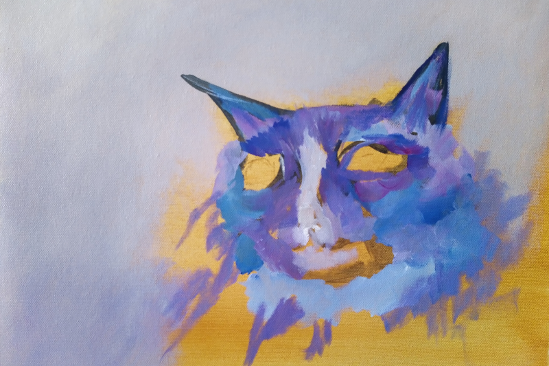
Adding Structure
Making a pink with my cadmium red medium, a little magenta and white, I paint in some lighter areas particularly where the nose is and around the eyes. Using watered down black, I mark in some more prominent features such as the nose outline, eye outlines.
Keeping the dark parts of the photo dark, I differentiate between the sides of the face through colour. One side is dark and blue based, the other side is dark but violet based.
Pull the image in
Adding to the depth, I darken up parts of the face around the nose and central stripe, keeping the blue and violet sides distinct. The mouth has some shape now, so I start to work with the cheeks and where the sides of the face finish and the background begins. I’m not doing much with the place below the face at this point apart from throwing on some of the colours I’ve already used to see how they look still working quickly and loosely.
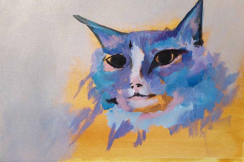
Adding light and defining the subject
On a portrait, I find it helpful to get the eyes ‘in’ near the beginning as they provide the template for the rest of the face. So I spent some time, but not nit picking too much, getting the eyes in place with pupils using black and then black with the smallest hint of one of my other colours so the black doesn’t look too black and out of place. Eyes create atmosphere and mood. Take a little time to get proportions in place.
Take a step back and take a look
I noticed that I seemed to be using lots of violet and blue in the rest of the work, so in the spirit of having fun, when doing the eyes, I added magenta/violet to one side of the iris and blue to the other side in one of the eyes. The other, I left with a more neutral pale violet. Highlights were added in accordance with the original photo to give the colourful cat portrait a realistic feel.
Lightening up the face
The original photo has a lighter browny/grey around the mouth and near the white markings. This is a great opportunity to use a lighter colour from my palette. I could use a light violet, blue, magenta and stick with what I’ve already got but I have a warm red (cadmium medium red) as part of my palette along with the unbleached titanium. I add light and warm red/orange tones using these colours. Working in a playful manner, not being too careful about where they are going, I add the lighter orange/warm tones in light shades, keeping an eye on the light and dark parts of the photo and placing them accordingly. By adding full strength cadmium red to very small patches in the darker places adds to the colour harmony, bringing all the colours together.
Reshaping features
The folded ear was too long so I used the background paint to cut into and reshape the ear, making it shorter and stubbier. I lengthened and widened the nose and extended the white markings under the nose getting a feel for where the darker and lighter parts of the features need to be.
The key is to stay in playful, fun mode. Experiment with the features. Anything you paint can always be corrected later.
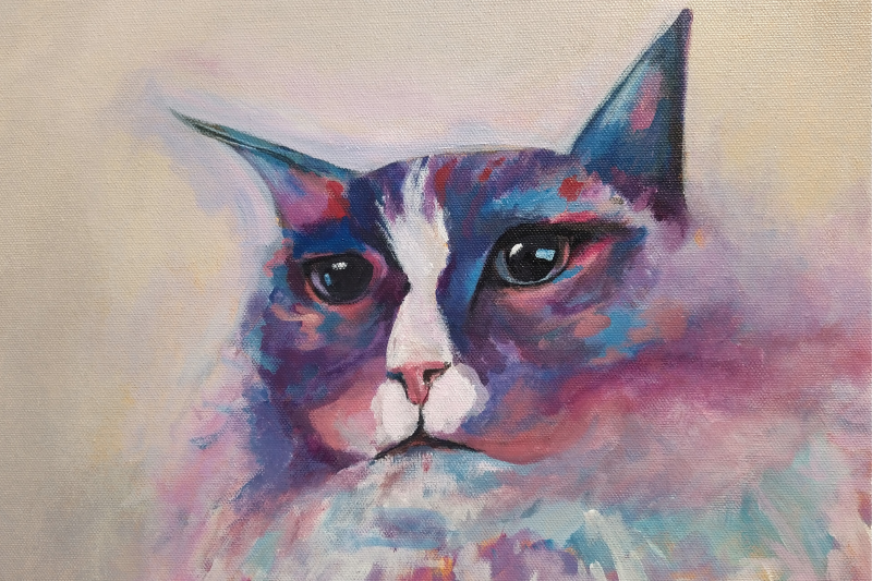
Half Way Mark
Take a step back and remember the focus! I find it helpful to make regular check ins with my original focus. Am I on track? What do I need to change to get back on track? Is this still my focus? What is my focus if it’s changed? Once I’ve reviewed my intentions, I can get back to my work.
Now, let’s explore how to sharpen up the finer details, add more plumpness to cheeks and make the finishing touches to producing a colourful and atmospheric cat portrait in acrylics.
Art tip for acrylics
Play with the features! The beauty of using acrylic paints is that they dry quickly and good quality, professional paints will offer good coverage so painting over ‘mistakes’ or parts of your work is easy and it dries fast so you can get straight back to it.
In this image you can see I changed the ear size and the shape of the head between the ears. I got a bit excited with the warmer orange tones and added them all over with the thought that they can be painted over if they don’t work. At this stage, I want to test it out, get a feel for how it looks. And I make an attempt to define the bottom jaw and mouth. I’m not looking for it to be perfect or just like the photo.
We’re back to shadows and mood. With the jaw more defined, adding dramatic shadowing can bring the whiter facial features forward, making them more prominent and eye catching. Again working in a loose fashion, I stick with my darker blues and violets to create depth under the face and to add definition to the cheeks. Not worrying that it’s not perfect, just getting an idea for the shadowing and colours.
Softening the edges of the face on the near side by blending through whites with their respective colours of blue and violet, creates a less defined look. At this point, I could continue on with filling out the cat neck as he’s positioned in the photo or I could leave it undefined, not needing to show the neck as such and allowing the viewer the freedom to fill in the gaps. This can also create atmosphere, allowing the viewer to co-create with you rather than giving them all the details.
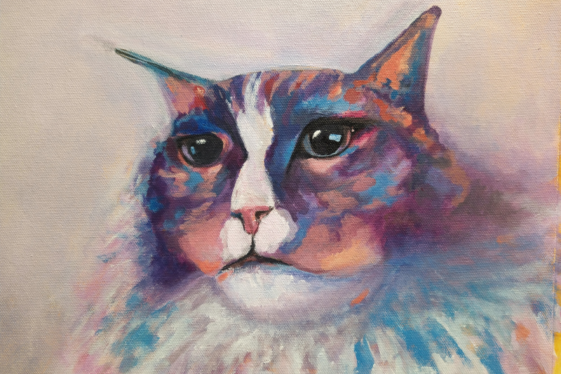
Finished Product
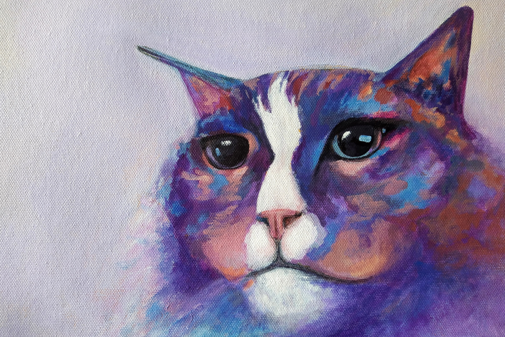
Here is the last image where the only change is the folded ear. I’ve added a little more shading to the underside but it is largely the same as before.
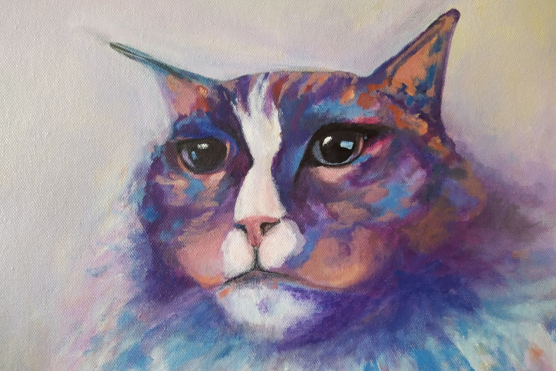
Adding mood by removing natural features
So now we have a pretty moody looking cat portrait, colourful and still beautiful. You may have noticed that he doesn’t have ‘fur’ painted in, nor whiskers. Intentionally not adding these natural features makes him less soft and cuddly but more serious and brooding.
I let the viewer fill in the gaps. They can see it’s a cat and don’t need all the little details that identify the cat as a cat. The big moment for me when I finish a work is the focus. Is the painting true to the focus, to the intention? Does it generate atmosphere? Can the viewer appreciate the feline point of view?
Each of us has our own experience with art and while the answer maybe different for all of us, if I can answer the questions in the affirmative, then my work is done. It doesn’t matter if it’s not exactly the same as the photo or if all the features aren’t present. The work is done.
How do you know your work is done?
I hope you enjoyed reading along with my art process to create a colourful cat portrait that’s a bit different.
You may like to check out other posts in skills and knowledge or my insightful artist series.